Imagine the world of branding before television. There were graphic devices used to loosely suggest the nature of a company’s business, there were poster graphics, propaganda graphics, branding for tourist authorities, railway companies, others 'selling leisure', and all manner of products.
Pre-television branding was not hugely sophisticated, so, when TV did come to the UK, there wasn't much to inspire would-be TV graphic designers. With the arrival of commercial competition, the BBC decided it needed to identify itself to viewers and would require something more exciting than a selection of test cards in between the programmes.
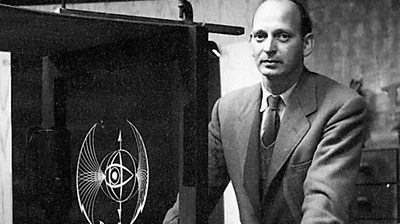
The notion that TV graphic design could in itself be a serious discipline didn't even emerge until the 1950s, when graphics designer Abram Games was commissioned by the BBC to produce the first ever on air TV symbol.
The bat's wings
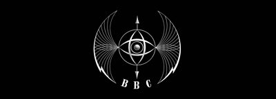
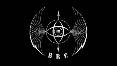
Commonly remembered as the 'bat’s wings', officially known as the 'Television Symbol' (or, in some hostile newspapers, simply as "the thing"), Games' design first went live on the 2nd December 1953, replacing the occasional use of the BBC Crest and various test cards, seen randomly between programmes.
Not much is known about why the BBC decided to pioneer a new approach to on air TV identity, and certainly the Corporation was unaware that it was, arguably, responsible for starting a whole new field of graphic design.
The success of the Festival of Britain had a large influence on BBC bosses though. Consistently and innovatively branded across various sites, spaces, buildings and publications, the Festival had a distinct and clear look, much commented upon in the trade press at the time.
The man behind the graphics scheme was Abram Games, and it was this that won him the BBC commission. The Society of Industrial Artists and departments within the BBC all pitched for the new on air symbol, but Games really stood out.
Abram Games
In 1953 the art of branding was still pretty rudimentary. The people who knew most about it were the men (and a few women) who designed advertising posters.
So when the BBC invited its own artists and others to come up with ideas, it is not surprising that the man who won the commission was one of the greatest poster artists of the 20th Century, Abram Games.
Games had produced advertising posters for oil companies and building societies, and propaganda and recruitment posters for the government during World War Two.
He was to go on to create striking and often rather surreal advertisements for railway companies, airlines like BOAC and BEA, breweries, newspapers and the Metropolitan Police.
Later he branched out into product design, creating the famous glass Cona coffee percolator.
But in 1951 - the year he won the BBC commission - he was best known as the designer of the logo for the Festival of Britain, the six-month celebration which introduced a country still recovering from years of wartime shortages and austerity to a world of ultra-modern architecture and design.
Games's logo for the festival cleverly married tradition (Britannia's head in profile), sharp modern lines (the four points of the compass) and celebration (a swag of bunting).
What does television stand for?
It took more than two years from the initial commission for Games to come up with some real plans for the symbol. Today commissioners of such projects normally dictate stringent turnaround times. Not so in the early 1950s. He spent a good deal of that time pontificating on the significance of television itself.
Was its social significance as yet fully understood, and with it being such a new medium, what sort of graphic device could possibly encapsulate what it might achieve in the future? He asked 'What did television stand for?' In 1951, there was no clear answer.
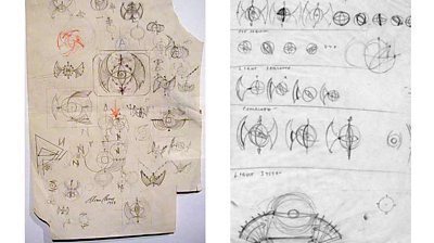
Games sketched ideas for the TV ident on a piece of newspaper. It might have helped if he had owned a television - but he did not. His daughter Naomi has her father's working drawings and sketches. She recalls that his best ideas came to him on public transport:
Buses were great to work on because nobody bothered him; there were no phones, no children; he could concentrate on a bus. So he used to scribble on anything that was available, a newspaper, scraps of paper that were in his pocket, and then he'd get into the studio, get onto his tall stool at his desk, lay out a sheet in front of him and begin, and he sometimes did hundreds and hundreds of these sheets of layout paper before he actually resolved his design.
Initial designs
Games initial designs were little more than sketches – circles, right angles, curves – just as well as anything more elaborate could have caused havoc for viewers forced to watch Britain's anachronistic low definition 405 line television system.
Games' more elaborate efforts would have really pushed the boundaries of TV graphics in the brave new world of the 625 line system introduced by Germany in 1950, but Blighty’s love affair with its home grown system was strong, and Games had to make the most of the system he was stuck with.
It became clear that only an arc or circle really worked, following tests carried out at the BBC's Lime Grove studios. His work progressed, slowly.
The Games archive reveals notebook after notebook of sketches and doodles that slowly show the bat’s wing’s concept. His thinking started to evolve. Television was a world medium, and the central sphere "he drew" might be thought of as the world, with light and television signals radiating outward from it.
He started thinking of light waves, and how these might be represented, perhaps arcs might do this, arcs being drawn out from the central transmitting globe. An all seeing eye was added too – the watching or receiving element of television. Not content with settling for a static representation of his ideas, Games went one stage further - the symbol must move! There must be a static element to hinge the entire arrangement, but why not have the eye elements rotating, or rotating in opposite directions?
Eventually, from all the hundreds of sketches, Games produced an initial submission to the BBC.
Making it work
After some ponderous thoughts by a specially convened BBC committee, Games was given the green light, and he set about translating the drawings into a living moving model. Although Games had designed and made physical household objects before, he felt the need to turn to outside help to realise the physical model for on air use.
He appealed to J F 'Johnny' Johnson for help. The sculptor and model maker was just the right person, not that Games ever really let the creation of the actual model out of his sight. Working together over every element, the model slowly emerged.
Eventually an actual model was created, consisting of brass, wood and stretches of thin wire. One small motor drove the three main elements of the model, the eye, the reverse rotating parts, and the world section. As the various moving sections of the model came into operation, lights were beamed across the 'wings', creating an extra, almost 3D-like dimension.
After a laborious and painstaking series of tests and adjustments (the symbol initially wobbled unnervingly), the day of filming had arrived. Everything was set. The model was switched on. It worked!
Filming commenced. A night of suspense followed. Would the lighting effects look as good on film as they did in reality? The film was developed and everything had worked – a success on every front. Rumour has it that the model stopped working after the film, luckily further filming wasn't needed.
The BBC issued an official description:
The abstract pattern consists of two intersecting eyes which scan the globe from north to south and east to west, symbolising vision and the power of vision. Flashes of lightning on either side represent electrical forces and the whole form takes the shape of wings which suggest the creative possibilities of television broadcasting.
According to Games's account book, the BBC paid him 200 guineas for the work, plus 70 guineas for an on-screen clock and 15 guineas "retainer".
Reaction
Games's cuttings book, in which the newspapers' reaction to the symbol's unveiling is recorded. Most didn't like it. One man wrote to the News Chronicle with an impressive list of the images conjured up by the symbol:
Menace, darkness, Germans, spiked helmet, bird of prey, baleful eye, cage, torture, bandaged head, nets, whips, thongs, aerial bombs, attacks, pincer movements and Fascist flashes.
Games was used to controversy. Among his wartime work had been a recruitment poster for the ATS, the women's auxiliary territorial service. After five weeks it was banned, the military brass having decided the model was far too attractive and wearing too much lipstick.
Naomi Games says her father was mischievous:
He enjoyed any kind of reaction. My father always believed a good design always gets noticed, and it doesn't matter whether it's liked or not. As long as it's noticed and commented upon it's done its job. That was true with his posters and with the television symbol, and I think he was very amused by the public reaction.
Abram Games's symbol kept on rotating for a total of 8 years.
BBC idents

Early Identities
The Television Service's visual branding, 1936-1953
Abram Games and the Television Symbol
The story of the bat's wings logo used between 1953 and 1960
Global Ambition
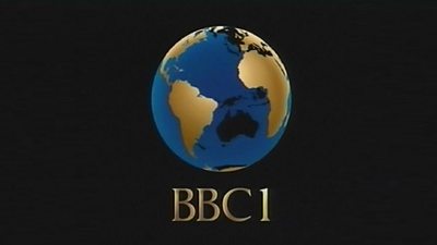
BBC One's visual identity 1960-1997
Into the New Millennium
BBC One idents from 1997 to the present day
BBC Two 1991
How BBC 2 was rebranded in 1991
BBC Two 2018 idents
The first new identity for BBC Two in 20 years
BBC Christmas idents
40 years of Christmas idents on BBC One and BBC Two
BBC Motion Graphic Archive

BBC Motion Graphics Archive at Ravensbourne University London
The BBC Motion Graphics Archive is a showcase of the history and development of motion graphics across the BBC and includes examples of opening titles, promotion trailers, stings, idents and programme content sequences.
