MATT: Hello and welcome to The Maths Show with me Matt Parker,today we’re going to deal with statistics in a significant fashion.
MATT: Particularly lines of best fit… they can take data and tease outtrends to help us understand the real world.
MATT: So hypothetically we could survey a lot of people about howmany episodes of The Maths Show, with me Matt Parker theyhave watched.
MATT: On the horizontal axis we have the number of episodes peoplehave watched of The Maths Show, on the vertical how wellthey understand correlation in statistics. Which is data, I’vejust made up.
MATT: To investigate what kind of trend it is we need to add a line ofbest fit. To do this you take a ruler – it actually helps if you putit up on its edge, so you can still see all of the data – and thenarrange it so there’s roughly half the data points on each sideand it’s as close to the data as possible.
MATT: Bare in mind, it’s called a line of best fit, not a line of perfectfit, so just do your best and once you’re happy draw the line in.Making sure you go all the way to the left until you hit thevertical y axis, and all the way to the right, until you hit theedge of the page…
MATT: Little pro tip, when you’re drawing your line of best fit it’s verytempting to make it go through the origin,
MATT: the corner of the plot. Where both the horizontal and thevertical axis equals zero. Very few relationships are zero at thesame time.
MATT: If we had a plot of the amount of rain against umbrella sales…yes there will be more umbrella sales when it’s raining, but ifit’s not raining, there will still be some umbrella sales.
MATT: Now where there may be some relationships where the line ofbest fit does go through the origin, will you get a question likethat in an actual exam? To find out, we’re joined by Carl, an examiner… Carl, would you write a question in an exam wherethe line of best fit goes through the origin?
CARL: No comment
MATT: I mean, okay, of course you can’t officially say, but givenstudents draw their lines of best fit through the origin withoutthinking about it, you’re not going to write a question wherethat’s accidentally correct?
CARL: No comment
MATT: Cause you’re too mean right?
CARL: No comment
MATT: Alright, so the moral of the story is, as we’ve learnt from Carl,examiners aren’t going to make your life easy. They almostdefinitely won’t give you a question where you put the line ofbest fit through the origin. Follow the rest of the data. Carl, asalways, it’s been great to see you.
MATT: Moving on, you’ll often be asked to read values off your line ofbest fit. Either going from the x axis to estimate something onthe y, or from y back to x.
MATT: In these cases, always draw your lines. A lot of people make amistake when they try to read the scale and get the wrongnumber off the axis.
MATT: If you draw your lines the examiner can see what you weretrying to do and you’ll get some markings for the working out.But be careful not to read data from outside your original data.It is very dangerous out there.
MATT: For example, here is a plot of the mens 100 meter sprintingworld record. You can see in 1912 it was up at 10.6 seconds
MATT: but by 2009 it was down at 9.58. It’s improved by a secondover the course of a century.
MATT: But if you were to continue a line of best fit from this dataright into the distant future, it would predict that in the year3,000 the race would be over before it had started. The only way you could win one of these races is fi you were atime traveller. You cannot trust your data outside the originalrange.
MATT: Finally, you might be asked to give a real world description ofwhat your line of best fit shows.
MATT: So for example, you might have to say that this is a positivecorrelation, as there is more rain, more umbrellas are sold.
MATT: Or another positive correlation, the more you watch TheMaths Show with me Matt Parker, the better you understandcorrelation.
MATT: Or, this is a negative correlation. The more you watch TheMaths Show with me Matt Parker, the less you understandcorrelation and statistics…
MATT: I mean that’s not gonna be the… can we get the real data? Justone data point? What do you mean that’s me?
Video summary
Mathematician and comedian Matt Parker simplifies the use of lines of best fit for students struggling to achieve a passing mark on the maths GCSE.
Looking at using lines of best fit, Matt explains how to draw these lines using data that your students are given and how to use those lines to interpret their data.
Designed as a revision tool using common mistakes highlighted in examiners reports we look at both good and bad use of the data by warning of the pitfalls in trying to extrapolate data.
With helpful graphics and a light-hearted approach, we are reminded about some useful exam techniques.
Matt also uses the 100m record as a clear way of showing how extrapolation can be problematic for data.
This short film is from the BBC series, The Maths Show.
Teacher Notes
During the video:
- Pause when Matt starts talking about lines of best fits and quiz your students to see if they know what things to watch out for when studying lines of best fit. Can they guess the pitfalls?
- It could be beneficial to have multiple graphs to refer to during pausing the video, so students could identify where the line was correctly drawn or where the learner has fallen in to the common errors.
After the video:
- Reflect on mark schemes. Look at the information that examiners need from a question. If you have already used peer marking before the video, get the same students to mark the same paper after the video, encouraging their checking skills.
- Extend students’ thinking to identify outliers - students could discuss whether outliers should be used when drawing your line of best fit. What could the causes of outliers be - human error or a real outlier?
- Can your students name real world examples of positive and negative correlation? Perhaps in football, stadium attendance per match and the home team’s performance? Weather and ice-cream sales? See what examples they can come up with and help them understand both positive and negative correlation. What are examples of no correlation? Weather in Bolivia and breakfast choices in a town near Birmingham?
Suitable for teaching maths at GCSE in England, Wales and Northern Ireland and National 4/5 or Higher in Scotland.
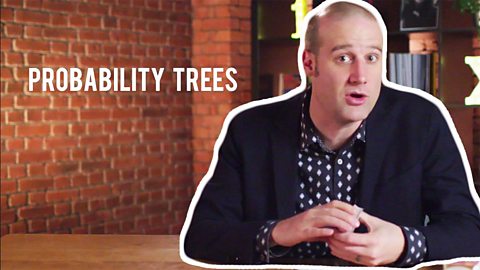
Probability. video
Matt demonstrates how to handle probabilities using probability and frequency trees.
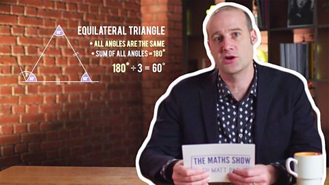
Geometry. video
Matt breaks down key GCSE angle problems into easy steps, including internal angles of polygons and bearings.
Exam Techniques for GCSE Maths. video
Matt offers advice for teachers and students on test-taking techniques specifically for the maths GCSE.

Ratio and Proportion. video
Matt explores ratio and proportion including converting ratios into fractions and graphical representation of ratios.

Fractions, Decimals and Percentages. video
A guide to converting fractions, decimals and percentages, applied to real-world problems.

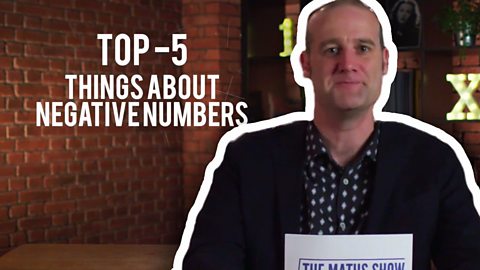
Algebra and Negative Numbers. video
Negative numbers are made easy as Matt breaks down his top five problems with negative numbers.
Algebra - Formulae and Graphs. video
Matt offers tips on identifying different graph types and their uses, as well as tips to avoid common mistakes when working with formulae.
