We ranked this season’s Premier League teams by how good their kits are
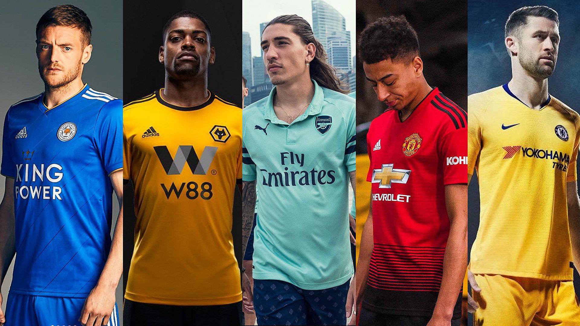
- Published
Kit designer Marlon Feeney-Thompson runs through every kit from the new season, from worst to best
It seems like the World Cup finished just last weekend, and already we’re staring down the barrel of another Premier League season, with Manchester United and Leicester City kicking things off on Friday night.
One way clubs are staving off any potential sense of football fatigue is by freshening up their kits for the coming season. But who’s going to be turning out in some top level threads, and who’s found their new clobber in the random aisle of their local discount continental supermarket?
To help us separate this year’s most fashionable from the biggest kit fails, we spoke to kit connoisseur and designer Marlon Feeney-Thompson, also known as Settpace.
The 24-year-old designs concept and real world kits for sportswear brands and video games, often integrating designer brands and elements from fashion to level-up a team’s look.
“I think it’s been quite positive this year," he says. "Some of the brands have been taking a few more risks, not just designing generic kits. Some of them are actually adding a bit more texture or patterns, unlike the bog standard boring kits that we seem to see every year.”
We asked Marlon to review every team’s kits from the 2018-19 season, taking into consideration all of their entries rather than focusing on just a specific home or away kit. He’s awarding marks out of ten for style, originality, and whether any of the kits can be worn as casual fashion items.
Here’s the league table everyone wants to top…
20. Brighton and Hove Albion
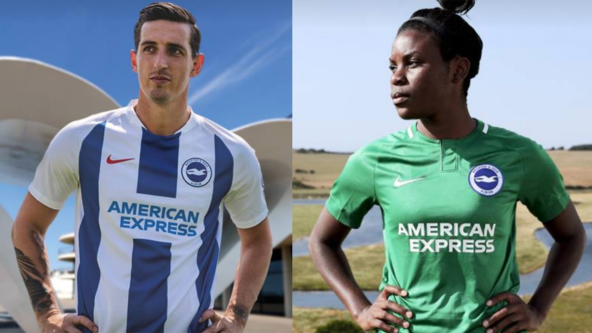
Brighton and Hove Albion
They’ve just gone with the generic template for Nike really and just added the crest and sponsor. I also think their away kit looks like a goalkeeper kit.
I don’t think you’d see anyone wearing that out. Well, I’d hope not anyway.
Style: 3/10. Originality: 2.5/10. Wearability: 2.5/10 - Total: 8 out of 30
19. Huddersfield Town
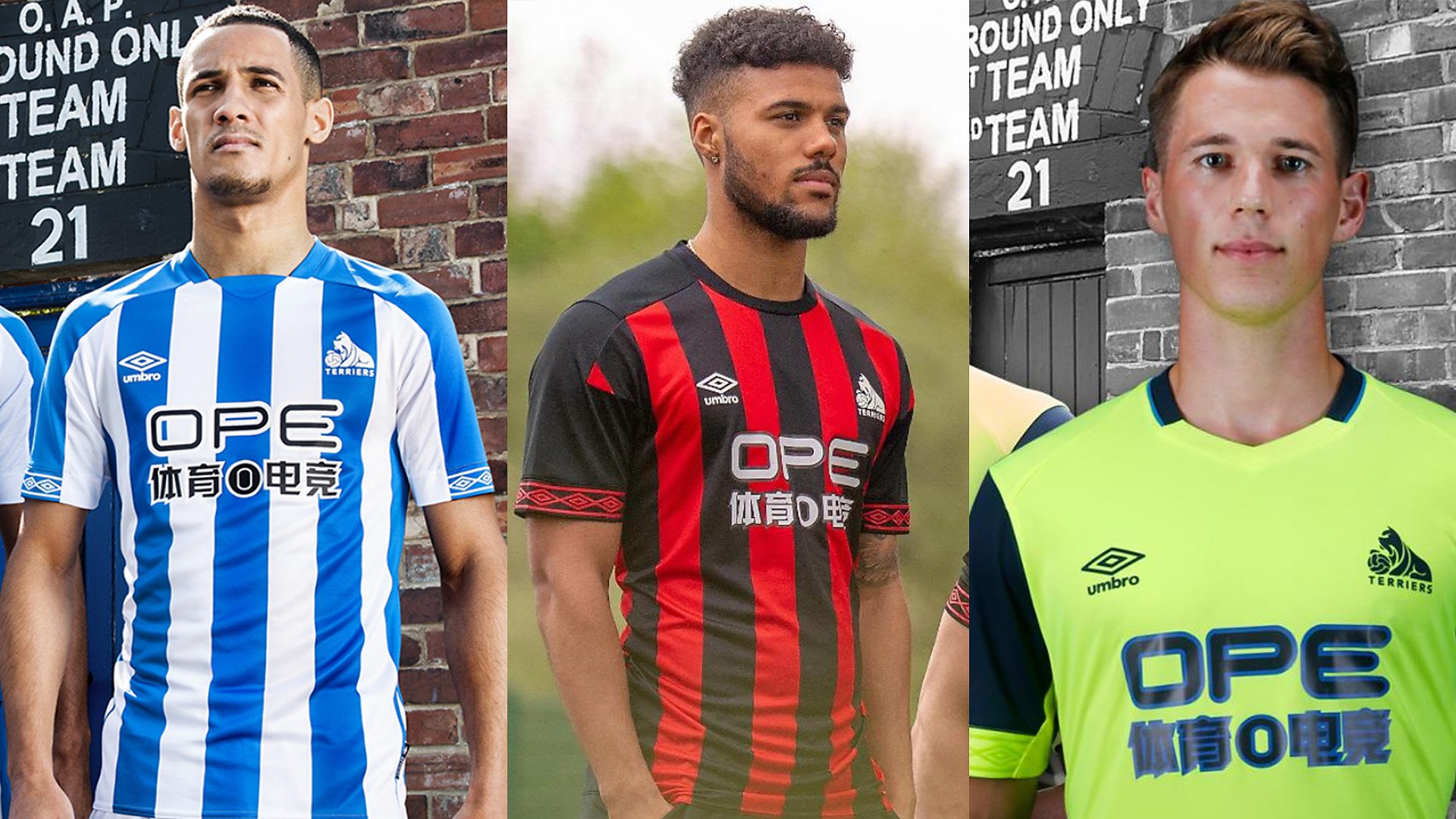
Huddersfield
If they would have added a bit more detail to the stripes, I would have liked the Huddersfield kit a little more, but it’s just a bog standard kit for me.
Sounds weird, I know, but it looks too much like a football kit. Obviously that is its main purpose, but fans also need to wear it, so it needs to have some sort of fashion element to it.
As for that fluorescent kit, I don’t know what is going on with that. Their style rating is going to have to come down a bit because of that.
Style: 2.5. Originality: 4. Wearability: 3 - Total: 9.5
18. Everton
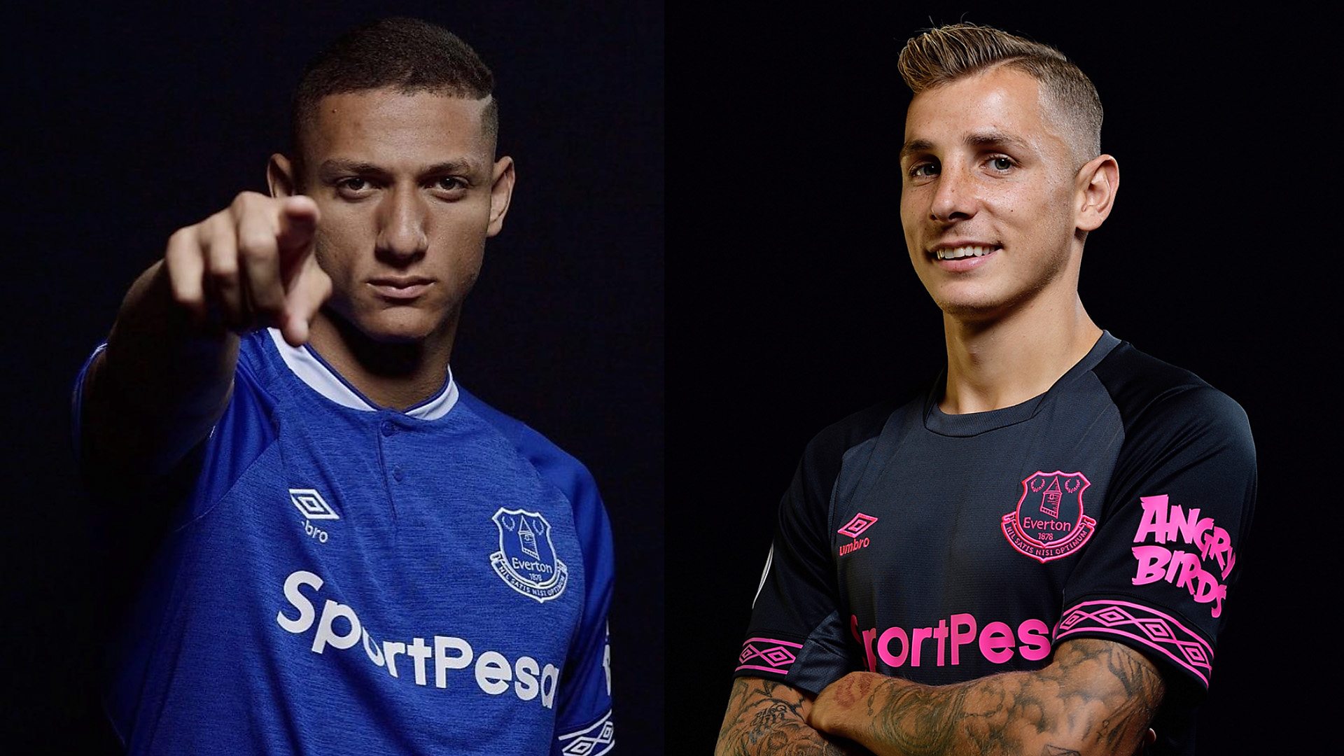
Everton
They’ve used a heather texture, which is a slight change to their generic Everton kit, but it’s not really doing it for me. It looks to me just like every other Everton home kit I’ve ever seen.
The colour palette for the away kit for me is just a little too bright. I think they’ve seen how last year's Arsenal away kit, external went down a storm with that similar colour palette, and they’ve tried to emulate that, but I don’t think it’s worked.
Also with the Angry Birds logo on the side, it just looks like a bit of a joke, especially in fluorescent pink.
If I were an Everton fan, I wouldn’t be seen in either of these kits.
Style: 4. Originality: 3. Wearability: 3 - Total: 10
17. Cardiff
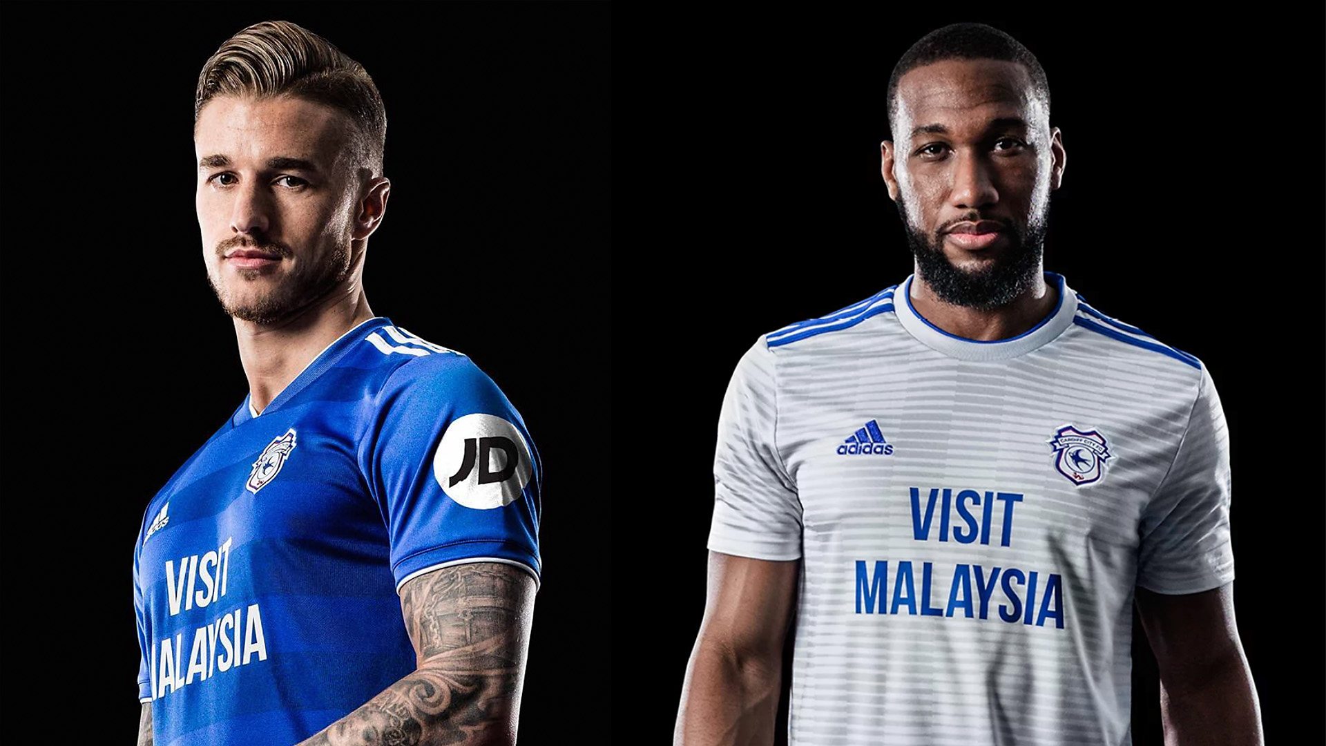
Cardiff
They look like they’ve just gone with the generic Adidas template on both their home and away kit.
I do like the pattern on the away kit, but I’ve seen it on quite a few other kits, so it’s not very original.
Style: 4. Originality: 3. Wearability: 3.5 - Total: 10.5
16. Southampton

Southampton
I don’t know what’s going on here with the Southampton kits. The stripes on the home kit just stop at the bottom of the collar, I don’t like that.
The Under Armour logo is also cut out of the stripes as well which is a bit strange to me. The whole home kit is strange to me, to be honest. They did change up the kits from last year so you have to give them some props for that, I guess.
Style: 4. Originality: 6. Wearability: 4 - Total: 14
15. Watford
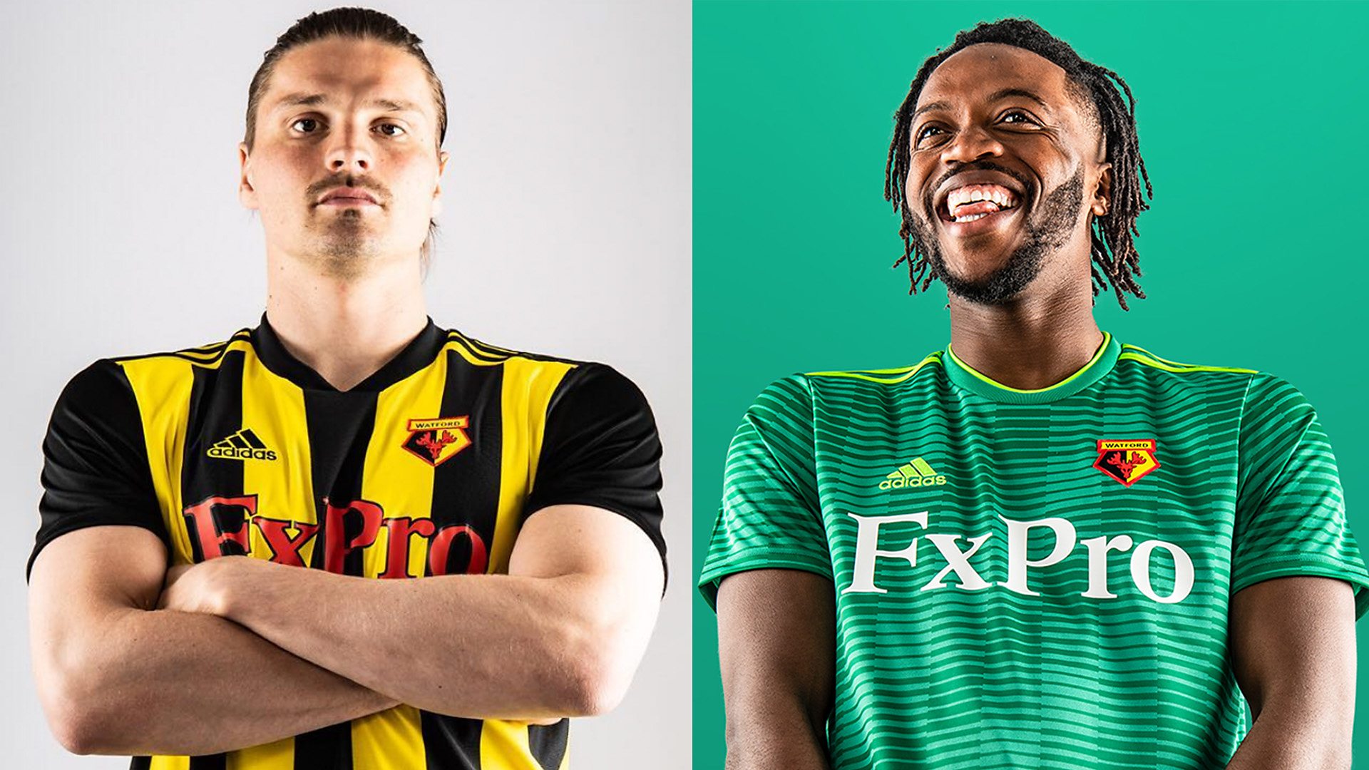
Watford
I don’t mind black and yellow, but I don’t like black, yellow and red. Obviously they're the colours on Watford's crest, so there’s not much they can do about that - and if they did, the fans would be killing them for it.
The away kit is the same generic Adidas template again, but I do like the green colour. I think they should have gone with a monotone logo on that. With a few tweaks, that could work.
Oh, and I don’t like that sponsor. It’s just too much.
Style: 5. Originality: 4.5. Wearability: 5 - Total: 14.5
14. Leicester
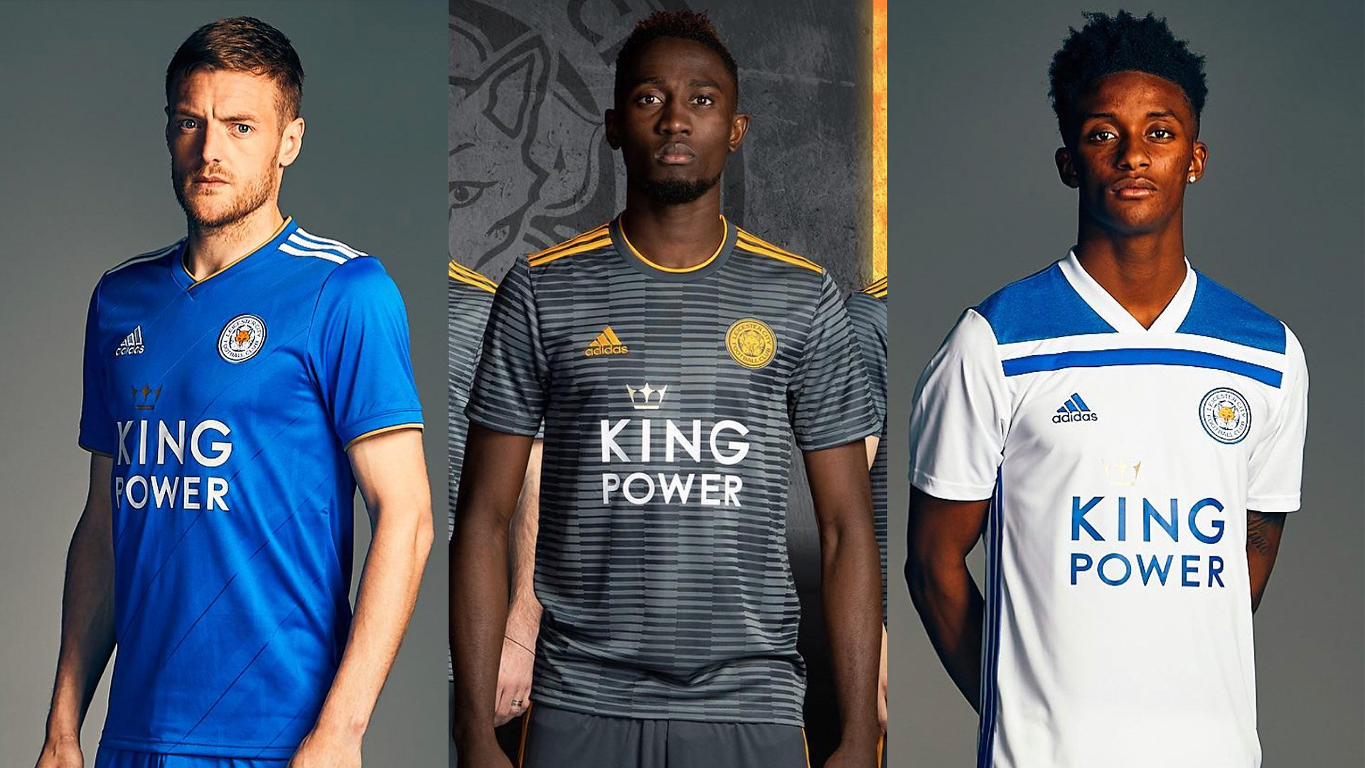
Leicester
They’ve added a subtle pattern going across on the away kit, but other than that, I’d say that’s what a Leicester kit looks like.
It’s Adidas’ first season with the Foxes, but I don’t think it’s made much of an improvement to their overall style ranking.
I liked all of the Leicester kits last year. I think Puma did a better job last season than Adidas have done this year.
Style: 5. Originality: 4. Wearability: 7 - Total: 16
13. Newcastle
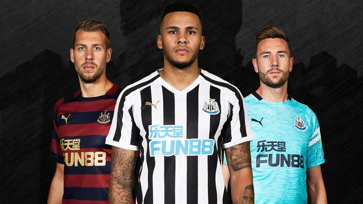
Newcastle
I think that Newcastle are the only Premier League team that can pull off the stripe, bar Crystal Palace.
All three colour palettes are nice, to be fair, and that sky blue sponsor doesn’t offend me too much because it matches the blue in the crest.
I like what Puma have done with all Newcastle's kits, except maybe the third kit.
Style: 7.5. Originality: 3.5. Wearability: 7 - Total: 18
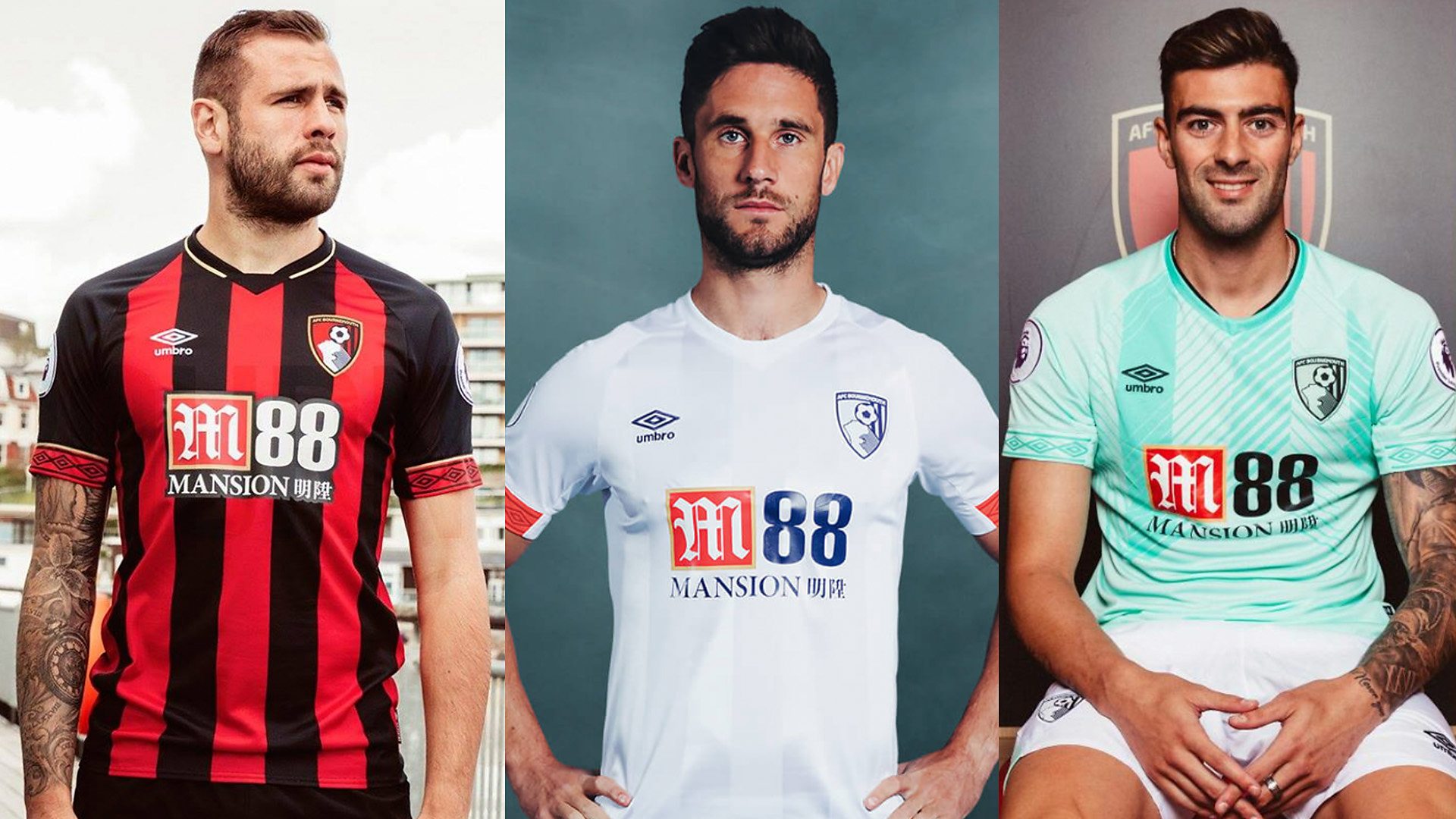
12. Bournemouth
Bournemouth
I’m not really a fan of the Bournemouth home kit, but the away kit surprised me when I first saw it. It’s very clean, sleek and it’s got a subtle pattern with the stripes.
Their home kit is pretty much the same as always, so they take a hit on originality for that, but I'd quite happily wear the away kit out, and I love the pattern of the third kit.
Style: 7. Originality: 4.5. Wearability: 7 - Total: 18.5
11. Liverpool

Liverpool
The home kit with the polo and the stripes along the shoulders looks a bit strange, but it’s the away kit that drags down the style score.
I can see people wearing the third kit as a fashion item because the print is so out there. People who don’t really know about football would pick this up and wear it.
Style: 5. Originality: 7.5. Wearability: 6.5 - Total: 19
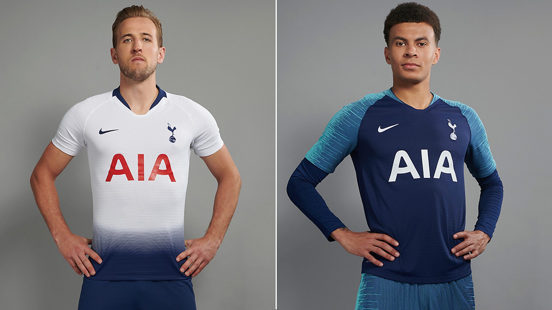
10. Tottenham
Tottenham 2018-19 Kit
Spurs' away kit is basically Barcelona’s training kit, but then again, it is nice. I like the half tone on their home kit as well.
They’ve changed it up slightly on the home kit, but then they’ve still gone with the red sponsor that fans don’t seem to like.
I do like the style of both kits, despite the fact that they’re not original.
Style: 8. Originality: 4.5. Wearability: 7.5 - Total: 19.5
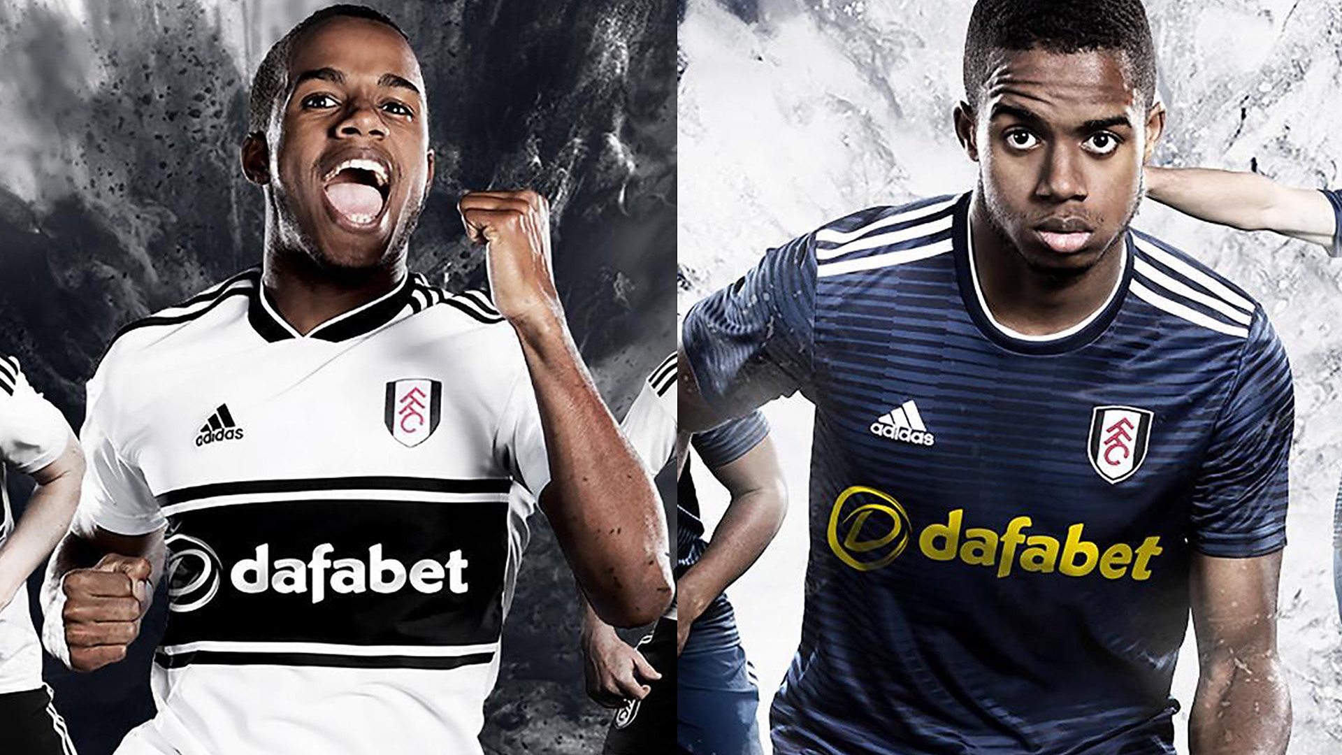
9. Fulham
Fulham
Their colour palette is black and white, so you can’t really go wrong with that. I personally like the home kit and it refers a bit to their history. I also like the band across the chest.
I don’t know why they’ve gone with the yellow sponsor on the away kit, though.
Style: 6.5. Originality: 6. Wearability: 7.5 - Total: 20
8. Burnley

Burnley
On the Puma template, I think the claret, blue, and white looks quite nice. As for the third kit with the white and black colour palette, it’s clean and minimalistic.
Sponsors can be a make or break a kit for me, and I think this one’s a bit too in your face. It actually works better when it’s in all black because it blends in a little more.
The away kit is nice as well. I really like the black and silver colour palette and the fading honeycomb pattern. I don't really like the collar, but overall I like what they've done.
Style: 6.5. Originality: 6.5. Wearability: 7.5 - Total: 20.5
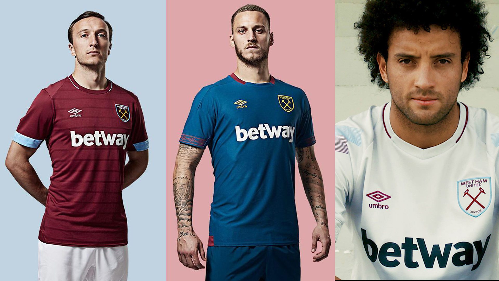
7. West Ham
West Ham
West Ham have impressed me this season with their kits. They’ve gone subtle with having the blue on the cuffs of their sleeves.
I can’t see West Ham fans having too many complaints with the colour palettes on all three shirts. There’s nothing on either three of these shirts that I’d change for West Ham. All three are wearable.
Style: 7. Originality: 6. Wearability: 8 - Total: 21
6. Arsenal
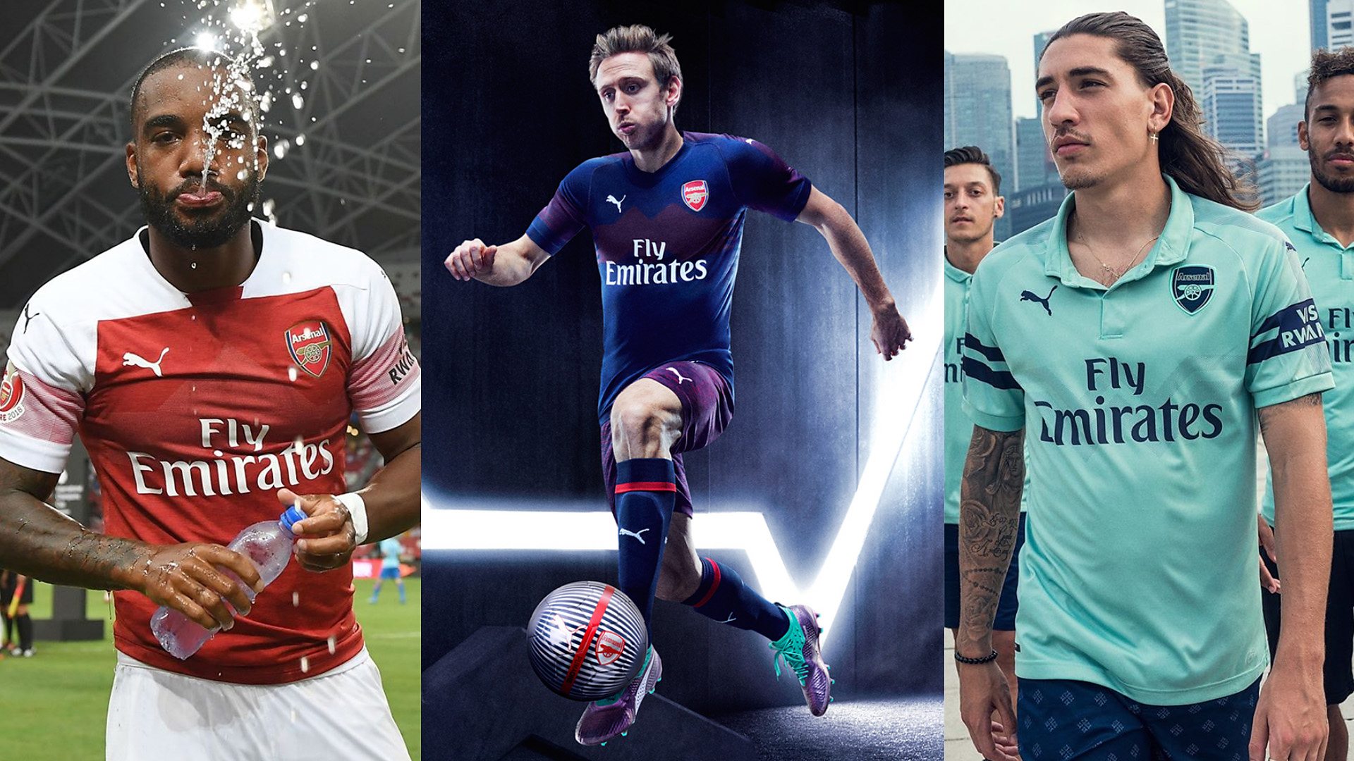
Arsenal
I don’t like the home kit. I don’t really know what’s going on with the straight line across the shoulders.
The away kit: although I don’t like this heather pattern that seems to be a theme this year, on this kit, I’ll make an exception.
I like the two-tone heather on the shorts, and I even like it on their shirts as well. I read that it’s a reference to some of their history, so I like it when the designers make a nod to the past.
I like the colour of the third kit, but I’m not a fan of the polo neck even though it does make it casual and quite wearable.
Style: 6.5. Originality: 7. Wearability: 8 - Total: 21.5
5. Chelsea
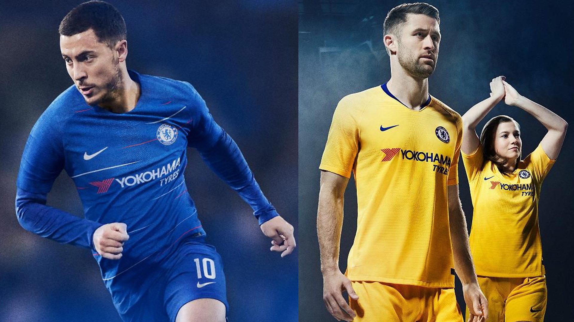
Chelsea
There’s obviously not much you can do with a home shirt, because it has to be a certain colour, but I like that they’ve brought in the flecks that match up with the sponsor.
The flashes of red on the home kit add something more, otherwise you’d be buying the same kit every season. The hardcore fans probably aren’t going to like it too much, though.
As for the away kit, it’s just a bit bland. I’d probably add some sort of print texture to it.
Style: 7. Originality: 6.5. Wearability: 8.5 - Total: 22
4. Manchester City

Manchester City
I don’t like the button on the collar of the home kit. It looks like pyjamas.
But the away kit, I really like. It’s minimal with a subtle colour palette change with a nod to the 1999 play-off final win.
Style: 8. Originality: 6. Wearability: 9 - Total: 23
3. Crystal Palace
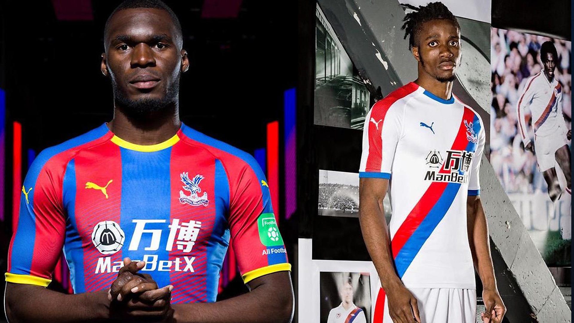
Crystal Palace
I think they’ve done really, really well this year. Both their home and away kits look good to me, and the sponsor doesn’t really offend me.
I like what they’ve done, and it’s a nod to the past and their history. I’d quite happily wear this to a sporting event if I was a Crystal Palace fan, maybe not out and about, though.
Style: 9. Originality: 7.5. Wearability: 7.5 - Total: 23.5
2. Wolves
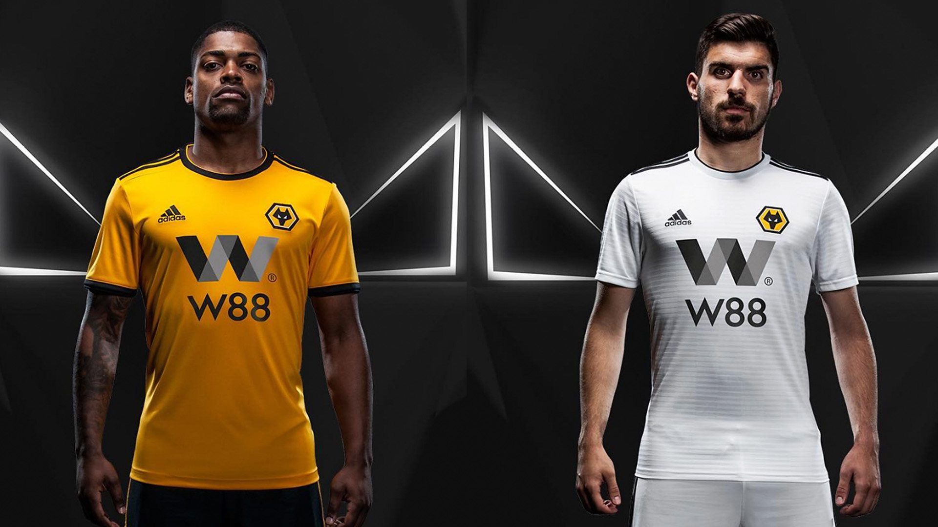
Wolves
I like both of the Wolves kits. They seemed to have either changed the pattern or gone for a more subtle approach in the colour palette.
The sponsor - although it’s quite in your face - complements the kit, being a ‘W’ as well.
They definitely have made an improvement from last year. I’d quite happily wear either of these kits.
Style: 8.5. Originality: 8. Wearability: 7.5 - Total: 24
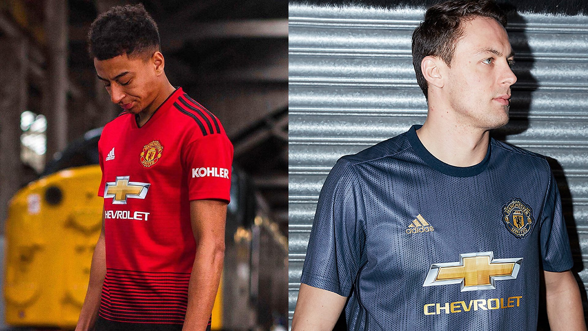
1. Manchester United
Manchester United
A lot of Manchester United fans initially didn’t like the home kit, but, from what I hear, it seems to be growing on them.
It just needed something different, because Manchester United is such an iconic club that every year they have to stick to the same red jersey, and they’re selling them at around £90 for a kit that looks the same, so I’m pleased that they have changed it up.
I’d actually wear that home kit if I was a Manchester United fan, because of the black half-tone.
On the third kit, I like the colour palette, but I’m not too sure about the material. I like the fact that it's made out of ocean plastic, but I think they could have done something a little different to make it look better.
Style: 8.5. Originality: 8. Wearability: 8.5 - Total: 25